Fitting a gaussian to your data

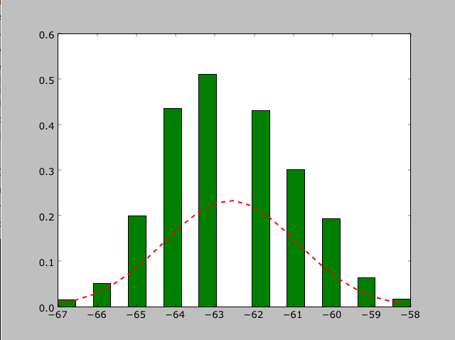
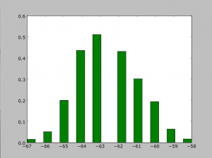
Let’s say you have a nice histogram, like this…

…and you want to fit a gaussian to it so that you can find the mean, and the standard deviation.  Follow these steps!

First, we have to make sure we have the right modules imported

>>> import matplotlib.pyplot as plt
>>> import matplotlib.mlab as mlab
>>> from scipy.stats import norm

Let’s say your data is stored in some array called data.

>>> (mu,sigma) = norm.fit(data)
Mu is the mean, and sigma is one standard deviation. If you don’t care about plotting your data, you can stop here.
>>> plt.figure(1)
>>> n,bins,patches=plt.hist(data,20,normed=1,facecolor=’green’,align=’mid’)
The number after data (20) is the number of bins you want your data to go into. Normed has to do with the integral of the gaussian.
>>> y = mlab.normpdf(bins,mu,sigma)
>>> plt.plot(bins,y,’r–‘,linewidth=2)

Now your data is nicely plotted as a histogram and its corresponding gaussian!

Intro to astrotools

The BDNYC Python module astrotools is now up and running for all to use and edit. This module is intended to be a collection of useful pieces of code for our everyday data handling needs. So far, astrotools is useful to handle fits files and spectral data. Additions to astrotools are welcome.

Let me clear out some relevant Python concepts. A module is simply a set of functional pieces of code. These pieces can be either functions or classes, among other things. A function is a code that executes an action, for example “make me a sandwich”. A class is a code that creates an object with specific characteristics and it allows you to handle this object very effectively. For the example above, you can have a class to create the person that will make the sandwich, a class to create a slice of mortadella, and a class to create mayonnaise. Of course, you can have functions that make no use of classes. More on that in a future post.

Where to find astrotools and how to install it

The module astrotools is available at https://github.com/BDNYC/astrotools as astrotools.py. Make sure that you download it into one of your Python folders in sys.path, which are the folders where Python looks for modules whenever you invoke one in your Python session. If you have no idea what I am referring to, please read this piece of Python documentation.

How to use astrotools

Now you are ready to invoke astrotools into your Python session. Type:

“import astrotools”

That’s it! You are ready to use astrootols functions and classes. For example, if you want to use the function that gets spectral data from a fits file, type:

“x = astrotools.read_spec(filename)”

and x will hold the output of the read_spec function. To learn about the functions and classes in astrotools, visit https://bdnyc.org/astrotools.

By convention, modules are invoked using a nickname, if only to make typing easier. I
suggest the nickname “at”. Then, import astrotools by typing:

“import astrotools as at”

To use it, type:

“x = at.read_spec(filename)”

In later posts I will describe in greater detail some important Python concepts as well as some guidelines to follow when editing astrotools.

Sherpa Part Two (Fitting)

I have spent the last month or so immersing myself in Sherpa, the Python-built program I am using to make the measurements of the Potassium absorption line at 1.2525 microns. While finally coming up for air, I am going to share how I’ve used Sherpa in order to fit a model (or rather, 3 combined models) to the spectral feature so I can make the desired measurements. I will walk you through an example, the plotting and fitting of target “DE1228”.

To start, you need to have all of the data available. Using the BDNYC database developed last semester, we load into arrays the wavelength, flux, and snr values from may 30th, 2007:

>>> w = bdnyc.targets[33].nir[‘high’][‘NIRSPEC’][‘2007may30’][61][‘wl’]
>>> f = bdnyc.targets[33].nir[‘high’][‘NIRSPEC’][‘2007may30’][61][‘flux’]
>>> snr = bdnyc.targets[33].nir[‘high’][‘NIRSPEC’][‘2007may30’][61][‘snr’]

I then used a series of numpy commands to chop the arrays so as to only contain the values from 1.25 to 1.255 microns. Once that was done, I converted the snr to uncertainty values and stored them in an array called “unc”. Since these actions did not require Sherpa, I will omit them from this post. Once I had this completed, it was time to create the Sherpa data structure required for analysis. You use these commands:

>>> from sherpa.astro.ui import *     # This is necessary if you are using Sherpa in a non-standalone version.
>>> data = unpack_arrays(w,f)        # Loads the wavelength and flux arrays into the data structure, which I’ve originally named “data”.
>>> data.name = ‘DE1228’              # Give Sherpa the name of the target — this is not necessary, but it will automatically title any plots from now on.

Now that the data structure is created, we can now start using the sherpa functions to load in the data, models, uncertainties, etc. and bind them to an “id” number. These are the commands I used next:

>>> set_data(1, data)              # I am using the id number “1”, which is the default id number, but I will explicitly state it so you can see how to state it.
>>> set_staterror(1, unc)         # Load in uncertainties as the error
>>> plot_data(1)                      # This plots the data. Error is automatically plotted as well. This is not a necessary step for fitting, but it’s so you can see what you’re dealing with.
>>> set_source(1, powlaw1d.pl+gauss1d.g1+lorentz1d.l1)       # I used a model containing a power law, gaussian profile, and lorentzian profile to fit the data and absorption line.

At this stage in the game, all of the data is now inputted, and now we have to play around. If you want to fit the models to the data, you have to use the fit command:

>>> fit(1)
If you do not prime the program by giving it some good values to start with, it may not come up with anything good. To prime, you can use:
>>> pl.ampl = 9
>>> l1. fwhm  = 0.0011
Etcetera. You basically give somewhat good values to start with, and then have it fit the data from there. However, I wanted to fit to the peaks of the continuum data, and the fitting function seemed to be very unstable, often iving me horrible fits even when primed, so I was unable to find a good fit without manually fitting the models to the data myself. For DE1228, I used the values:

>>> pl.gamma = 10
>>> pl.ref = 1
>>> pl.ampl = 8.6
>>> l1.fwhm = 0.00115
>>> l1.pos = 1.25251
>>> l1.ampl = -0.00093
>>> g1.fwhm = 0.00021
>>> g1.pos = 1.25255
>>> g1.ampl = -0.157

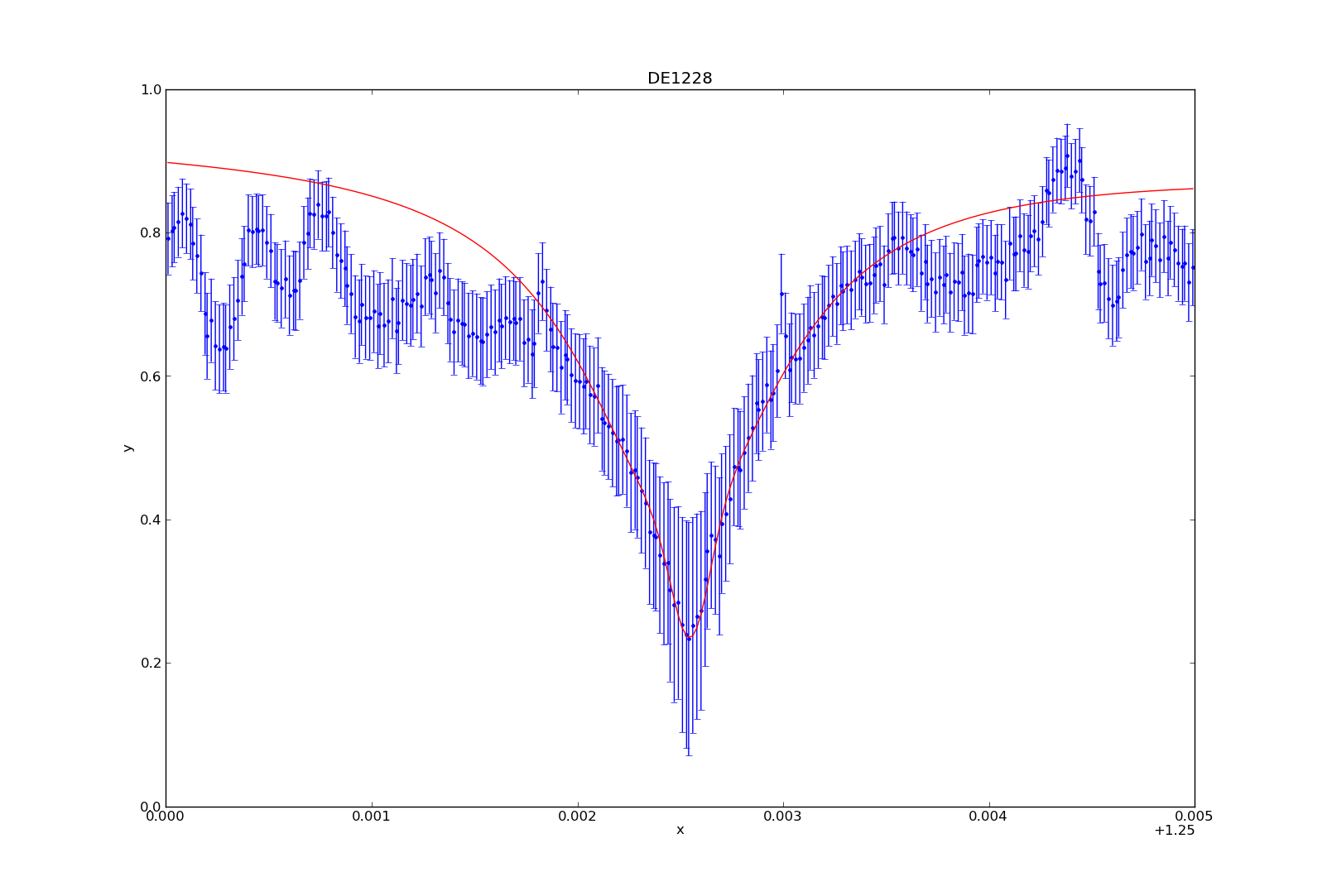
Once you’ve fit the model to the data (either manually or not), you can plot the fit by typing:

>>> plot_fit(1)
You can then plot (or overplot) the different model components:

>>> plot_model_component(pl, overplot=True)
>>> plot_model_component(g1, overplot=True)
>>> plot_model_component(l1, overplot=True)
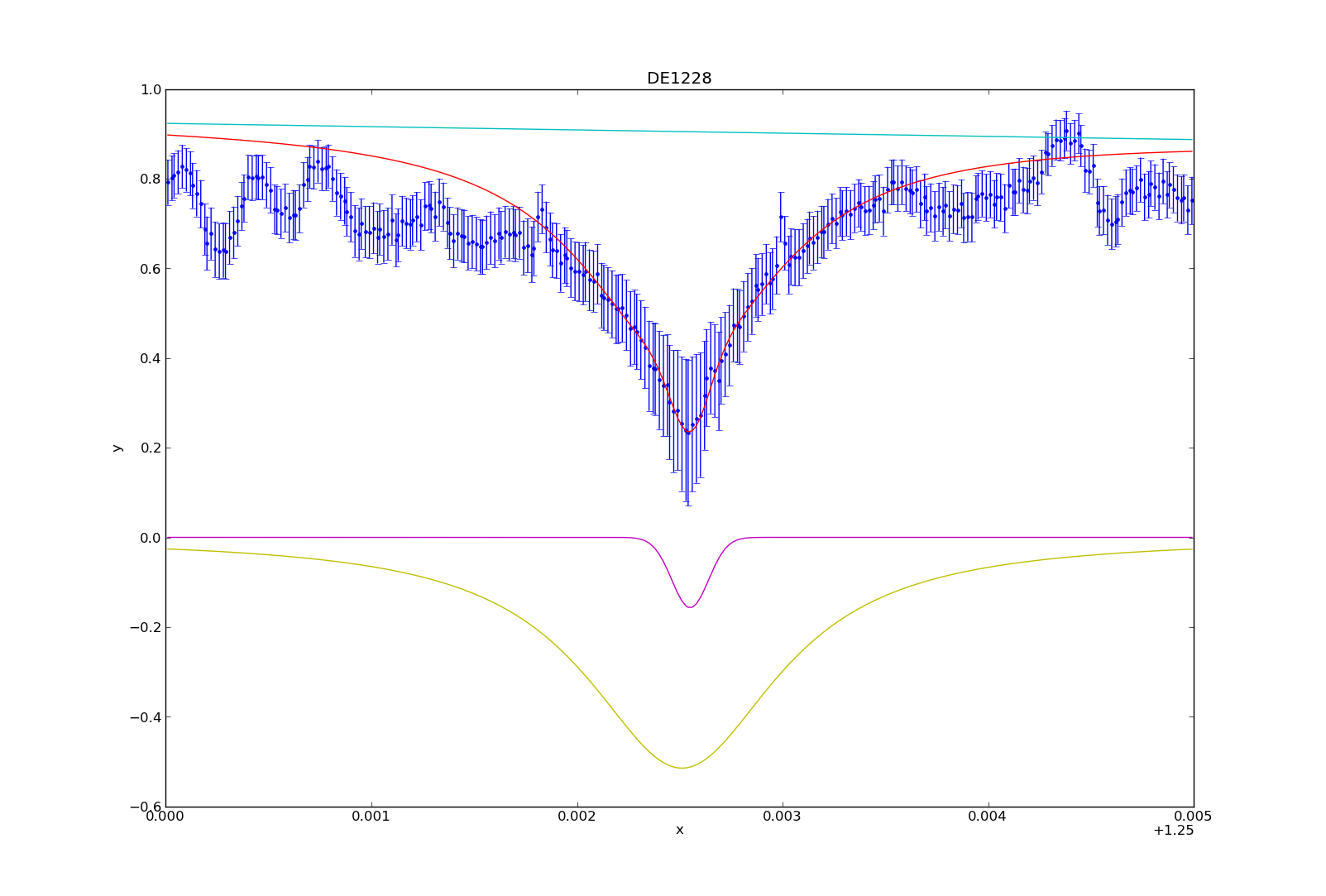
And that’s how I fit the models to the potassium absorption line. I’ve consolidated a lot of these numbers and commands into a table and python module (sherpa_tools.py). While specific, parts of the module can be applied to other people using Sherpa, so I can share the code if needed. In my next blog post, I’ll describe how to utilize the model to make the spectral line measurements (i.e. equivalent width, line-to-continuum flux ratio, full width half maximum).

Finding radial velocities

I’ve made good progress on a Python code for finding the radial velocity of an object, and expect it to be done soon!  I’m looking forward to finding some radial velocities, and then using the information to determine cluster membership for the brown dwarfs in our sample.

I thought I’d just outline the very basic steps involved in finding radial velocity.

1) Cross correlation: cross correlate two spectra to find how much one is shifted in relation to the other (in pixels).  One of these spectra should be a standard for which the radial velocity is known.

2) Convert this shift in pixels to a shift in velocity.  Note that this is the velocity with respect to the standard object.

3) Subtract the velocity of the standard from the velocity shift to obtain the radial velocity of your object!


Fitting a power law to data

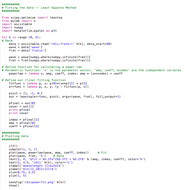
I wanted to fit a power law function to data, not a polynomial. Here’s how I did it.

I used the least squares method.

How to fit a power law to the data

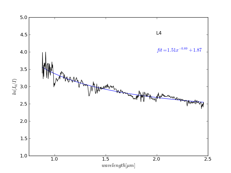
power fit to L4 data

Example of a power law fit to data

If you prefer other types of functions, just change the function form to whatever you want to fit when you define it.

The inputs for leastsq are the error function (difference between data and a function you want to fit) and initial conditions. When full_output = nonzero, it returns the covariance matrix in addition to the parameters that minimize the sum of squares of the error function.

What would you fit a power law function to?

Reading & Writing (table data) Fits Files in Python

This is one technique of writing arrays to fits files and correspondingly accessing those arrays. I create a fits file where each column of data corresponds to an array. In this example I have three ndarrays (wv_full_test,  fx_full_test, and (fx_full_test*.1).

(1)  Writing table data arrays to a fits file:
$import pyfits

$col1 = pyfits.Column(name = ‘wave’, format = ‘D’, array = wv_full_test)
$col2 = pyfits.Column(name = ‘fx’, format = ‘D’, array = fx_full_test)
$col3 = pyfits.Column(name = ‘fx_error’, format = ‘D’, array = (wv_full_test*.1))

$cols = pyfits.ColDefs([col1, col2, col3])
$tbhdu = pyfits.new_table(cols)
$hdu = pyfits.PrimaryHDU()
$thdulist = pyfits.HDUList([hdu, tbhdu])
$tbhdu.writeto(‘filename.fits’)

(2) Reading fits files into table data arrays:
$input = pyfits.core.getdata(‘filename.fits’, 1)

(3) To access each individual array:
$wavelength_array = input.field(‘wave’)
$fx_array = input.field(‘fx’)
$fx_error_array = input.field(‘fx’)

For more information take a look at the Pyfits Handbook


Rebin Numpy Arrays in Python

I’m currently working to determine radial velocities of suspected young brown dwarfs. I’m working with high resolution optical spectra collected from the MIKE Spectrograph on Magellan II. Through this process I’ve gained a much better understanding for data analysis and reduction in Python.

One such helpful tool I recently discovered in Python is how to rebin numpy arrays. Vivienne and I are cross-correlating two stellar spectrums to determine the relative pixel shifts between the two. These pixel shifts correspond to wavelength shifts of the emitted stellar light due to the doppler effect. In order to gain a more precise measurement of the relative pixel shift I rebinned the data. Data rebinning is useful when you want to reduce or increase the amount of data you’re working with, without losing important information. I rebinned my data from a precision of 1 pixel to .1 pixel.

Below is a plot of the Rebinned (blue) and Original (red) Flux & Wavelength Data.

I wrote a script in Python to rebin the data. The useful commands are:

#convert wavelength & flux into from lists to arrays called wave_array & fx_array
wave_array = numpy.asarray(wave_nz, dtype = float)
fx_array = numpy.asarray(fx_nz, dtype = float)

#rebin data array by a factor of 10.
wv_full_test = scipy.ndimage.interpolation.zoom(wave_array, 10)
fx_full_test = scipy.ndimage.interpolation.zoom(fx_array, 10)


Near-Infrared Field L Dwarf Sequence

Spectral average templates of 1–2.5 micron SpeX prism spectra of optically-classified field L dwarfs. Each of the three bands (JHK) are normalized across the whole band and plotted individually to remove the effect of the overall slope (color-term) of the spectrum. This allows the spectral features to be compared more directly.

The spectral features from L0 to L5 change gradually in the same direction, making a nice sequence in all three bands. The spectral features in the later type objects (L6–L8), however, do not follow the same trends as the earlier type objects and are therefore plotted separately.

The Planck functions for 2000, 1800, and 1600 K are shown (with arbitrary normalization) as dotted lines on the L0–L5 sequence. While molecular effects dominate the spectral morphology at most wavelengths, the shape of the J-band peak at 1.3 microns seems to be most sensitive to the underlying temperature-dependent Planck function rather than the strength of a particular absorption feature. It also looks like the slope of the H-band spectrum on either side of the water bands could also be modulated by the underlying Planck function rather than the water absorption itself.

How to add data to the database

Here are some guidelines for inputting data into the BDNYC database!

Part 1: Opening database

This should be done in the directory in which you have the database stored.

>>> import pickle
>>> import BDNYC
>>> f=open(‘BDNYCData.txt’,’rb’)
>>> bdnyc=pickle.load(f)
>>> f.close()

IMPORTANT: BDNYC and bdnyc are not the same thing.  Throughout this tutorial I use both BDNYC and bdnyc.  Make sure to keep track of which is which when using these commands.

Part 2: Create a dictionary that holds your data

The first thing you need to do is check whether the target is already in the database.  You do this by checking whether the u number exists in the database. (Inside the parentheses goes your u-number in single quotes. Ex. ‘U12140’):

>>> bdnyc.matchUNum(‘unum’)

If the target exists in the database, it will output the target index.  You will need this index when inputting the data. Continue reading

Formatting Plots for Paper in Python

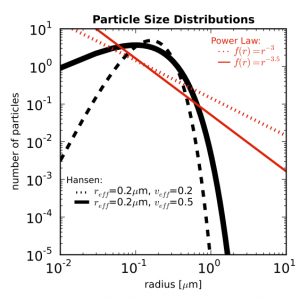
Say you have a nice figure and you want to make it look good in your paper. Figures in  papers will be in the dimension of 8.9cm x 8.9cm (3.6in x 3.6in) so you want to make them clearly legible when shrunk to this size. Something like this.


You can set the size of your figure by doing

figure = matplotlib.pyplot.figure(figsize=(3.6, 3.6))

then you can check what it looks like in that dimension on your screen.

You may need to set the size of the plot so that all the axis titles are inside the figure. These parameters worked for me.

subplot = figure.add_subplot(1, 1, 1, position = [0.2, 0.15, 0.75, 0.75])

In the position bracket are [left (y axis position, x_0), bottom (x axis position, y_0), width (length of x axis), height (length of y axis)] of your plot.

To set the x and y limits on the axes, use set_xlim([xmin, xmax]) and set_ylim([ymin, ymax]).

To make the plot simple, you want to keep the variation of color and style to a minimum. Maybe combinations of a couple of colors and a couple of simple line styles. You can edit line width, line color, and line style by adding arguments to your plot command. 
Continue reading