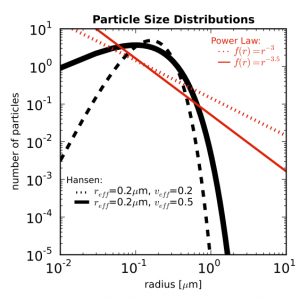
Say you have a nice figure and you want to make it look good in your paper. Figures in papers will be in the dimension of 8.9cm x 8.9cm (3.6in x 3.6in) so you want to make them clearly legible when shrunk to this size. Something like this.
You can set the size of your figure by doing
figure = matplotlib.pyplot.figure(figsize=(3.6, 3.6))
then you can check what it looks like in that dimension on your screen.
You may need to set the size of the plot so that all the axis titles are inside the figure. These parameters worked for me.
subplot = figure.add_subplot(1, 1, 1, position = [0.2, 0.15, 0.75, 0.75])
In the position bracket are [left (y axis position, x_0), bottom (x axis position, y_0), width (length of x axis), height (length of y axis)] of your plot.
To set the x and y limits on the axes, use set_xlim([xmin, xmax]) and set_ylim([ymin, ymax]).
To make the plot simple, you want to keep the variation of color and style to a minimum. Maybe combinations of a couple of colors and a couple of simple line styles. You can edit line width, line color, and line style by adding arguments to your plot command.
★ linewidth = # (float number)
★ linestyle = ‘-‘ (solid), ‘–‘ (dashed), ‘:’ (dotted)
★ color = ‘k’ (black), ‘r’ (red), ‘b’ (blue), ‘g’ (green), ‘c’ (cyan), ‘y’ (yellow), ‘w’ (white)
You can combine color and style into one argument like ‘k-‘ (black solid) or ‘r:’ (red dotted).
Here is an example of a plot command with some arguments.
subplot.loglog(r, nr, ‘k–‘, linewidth = 3)
This creates the black dashed line in my plot above. (I’m plotting on a log-log scale). You want to make your favorite line (best result) stand out. I made it the thick black solid line in my plot.
You can also change the size and weight of your text by adding these arguments.
★ fontsize = # (float number)
★ weight = ‘bold’
Weight keyword can be anything between ultralight and black though on this scale there are only regular (ultralight to roman) and bold (semibold to black) so don’t ask me the difference between semibold and demibold. They look the same. You can also change the color using the same color argument above.
Here’s an example of my text command.
subplot.text(1, 4, ‘Power Law:’, color=’r’, fontsize = 8, weight =’medium’)
This gives the text on the upper right corner of my plot. The first two arguments are x and y coordinates. You can also edit axes and title in a similar way. You don’t need to set coordinates for axes and title.
You should put this command at the end when all the beauty treatment for your figure is done so that it will be saved as an eps file which you need for your paper.
figure.savefig(‘pretty_plot.eps’)
Enjoy spring!

