How to Make Animated GIFs of Plots

So you’re swimming in countless plots of your data over some changing parameter. Sure they’re nice to look at, but are they animated? Didn’t think so.

Here’s how to create an animated .gif image of those Python plots using Photoshop.

Step 1: Generate the plots

I’ve found that a few lines of Python to programmatically draw and save your plots to a folder eliminates a lot of editing and tweaking later on.

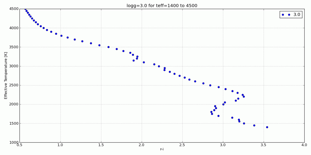
For this tutorial, I’ll use my synthetic photometry code to generate color-parameter plots across surface gravities of 3.0dex to 6.0dex.

First I created a folder on my desktop to dump the plots called RI_teff.

Then in the Python interpreter it looks like:

In [1]: grav = [round(i*0.1,1) for i in range(30,61)]
In [2]: import syn_phot as s
In [3]: for i in g:
s.color_param('R','I',logg=i,save='/Desktop/RI_teff/')

Now I can create the animated .gif in Photoshop.

Step 2: Pull plots into Photoshop as layers
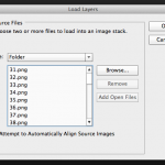
Open Photoshop and click File > Scripts > Load Files into Stack…

Select the folder on your Desktop that has all the plots and click ok.

Photoshop will open each image as a layer in a new project window.

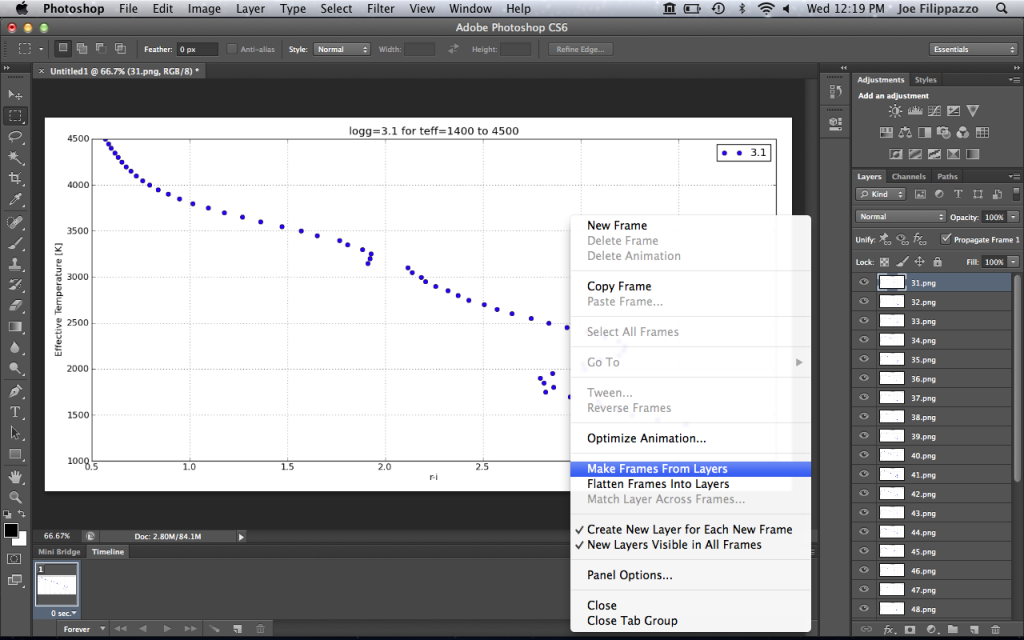
Step 3: Create frames from each layer

Next click Window > Timeline to show the Timeline across the bottom of the program.

In the top-right corner of your Timeline, you’ll see a little button that has all the Timeline options. Click it and select Make Frames From Layers. Here’s what it looks like:

This will populate your Timeline with one frame for each image layer.

Click the Timeline options button again and click Reverse Frames if necessary. Otherwise, you can drag and drop the frames into the desired order.

Step 4: Timing is everything
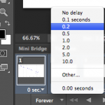
Next we need to set the timing of each frame. Select the first frame from the Timeline then hold down the Shift button and select the last frame to select them all.

Next click on any frame where it says 0 sec. with a down arrow. Then select the display time for each frame in the animation.

I typically set the frames to be 0.2 or 0.5 seconds each, depending on the number of total frames. Then I set the last frame to be 2 seconds so it’s as if the image pauses when it finishes before starting the animation over.

Step 5: Save it!

Finally, click File > Save for Web… and make sure you have GIF filetype selected. Click Save and you’re done! Here’s the result:

Fitting a gaussian to your data

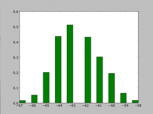
Let’s say you have a nice histogram, like this…

…and you want to fit a gaussian to it so that you can find the mean, and the standard deviation.  Follow these steps!

First, we have to make sure we have the right modules imported

>>> import matplotlib.pyplot as plt
>>> import matplotlib.mlab as mlab
>>> from scipy.stats import norm

Let’s say your data is stored in some array called data.

>>> (mu,sigma) = norm.fit(data)
Mu is the mean, and sigma is one standard deviation. If you don’t care about plotting your data, you can stop here.
>>> plt.figure(1)
>>> n,bins,patches=plt.hist(data,20,normed=1,facecolor=’green’,align=’mid’)
The number after data (20) is the number of bins you want your data to go into. Normed has to do with the integral of the gaussian.
>>> y = mlab.normpdf(bins,mu,sigma)
>>> plt.plot(bins,y,’r–‘,linewidth=2)

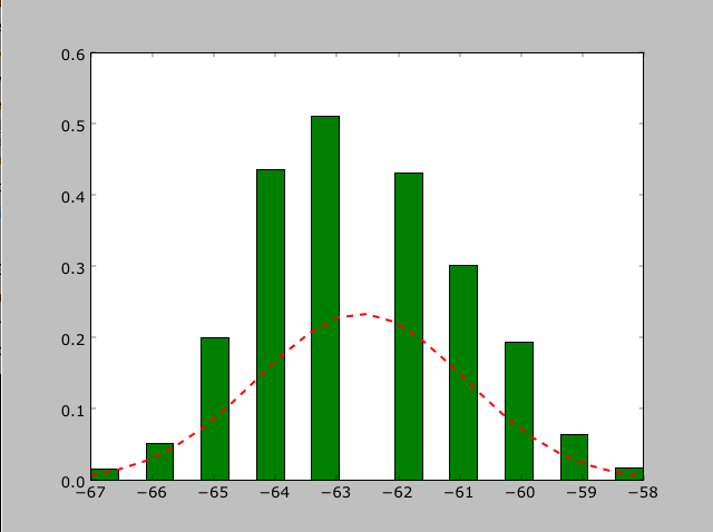
Now your data is nicely plotted as a histogram and its corresponding gaussian!

Sherpa Part Two (Fitting)

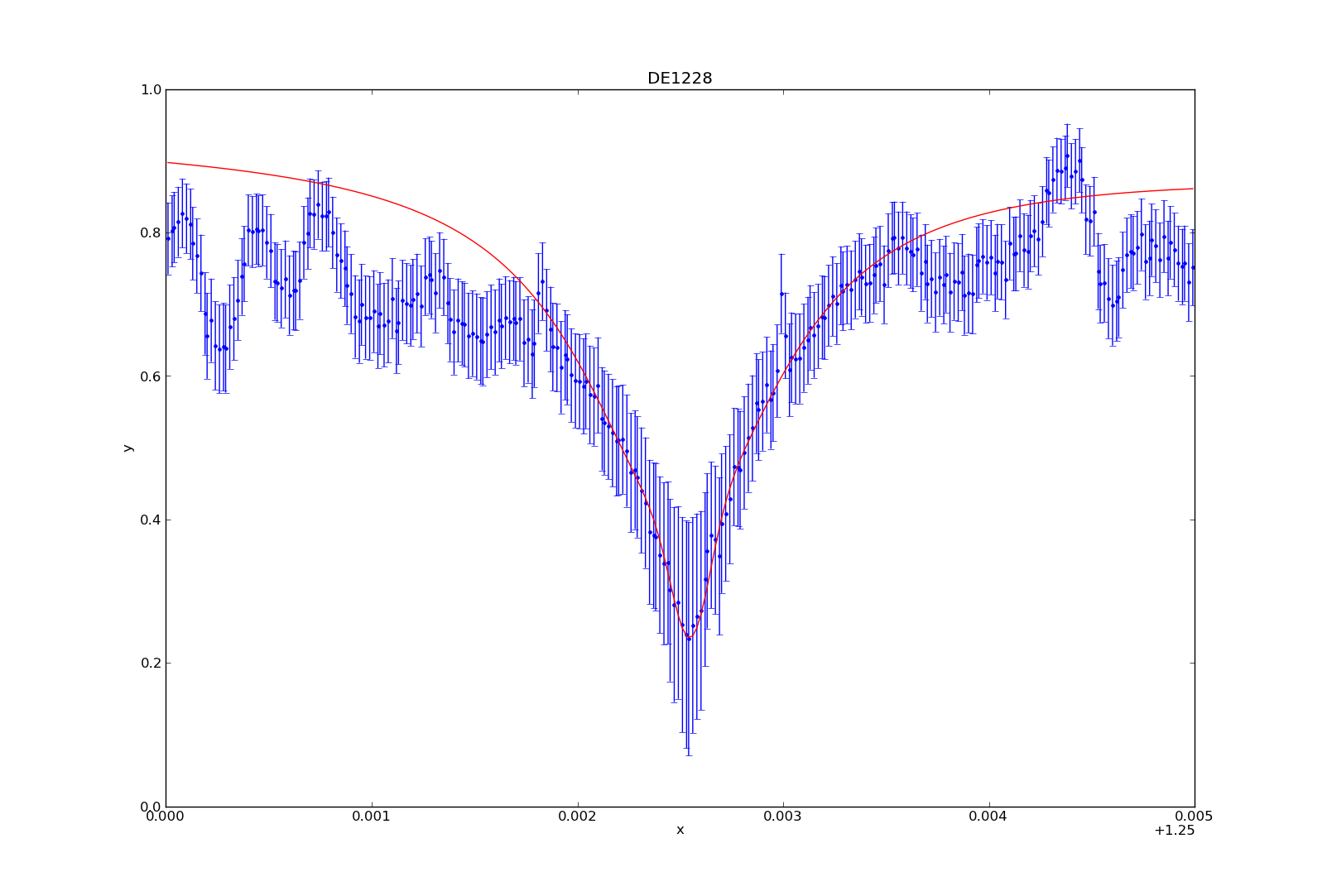
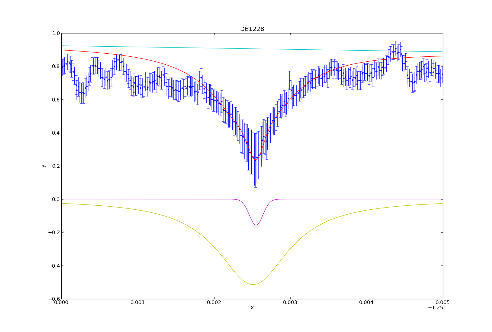
I have spent the last month or so immersing myself in Sherpa, the Python-built program I am using to make the measurements of the Potassium absorption line at 1.2525 microns. While finally coming up for air, I am going to share how I’ve used Sherpa in order to fit a model (or rather, 3 combined models) to the spectral feature so I can make the desired measurements. I will walk you through an example, the plotting and fitting of target “DE1228”.

To start, you need to have all of the data available. Using the BDNYC database developed last semester, we load into arrays the wavelength, flux, and snr values from may 30th, 2007:

>>> w = bdnyc.targets[33].nir[‘high’][‘NIRSPEC’][‘2007may30’][61][‘wl’]
>>> f = bdnyc.targets[33].nir[‘high’][‘NIRSPEC’][‘2007may30’][61][‘flux’]
>>> snr = bdnyc.targets[33].nir[‘high’][‘NIRSPEC’][‘2007may30’][61][‘snr’]

I then used a series of numpy commands to chop the arrays so as to only contain the values from 1.25 to 1.255 microns. Once that was done, I converted the snr to uncertainty values and stored them in an array called “unc”. Since these actions did not require Sherpa, I will omit them from this post. Once I had this completed, it was time to create the Sherpa data structure required for analysis. You use these commands:

>>> from sherpa.astro.ui import *     # This is necessary if you are using Sherpa in a non-standalone version.
>>> data = unpack_arrays(w,f)        # Loads the wavelength and flux arrays into the data structure, which I’ve originally named “data”.
>>> data.name = ‘DE1228’              # Give Sherpa the name of the target — this is not necessary, but it will automatically title any plots from now on.

Now that the data structure is created, we can now start using the sherpa functions to load in the data, models, uncertainties, etc. and bind them to an “id” number. These are the commands I used next:

>>> set_data(1, data)              # I am using the id number “1”, which is the default id number, but I will explicitly state it so you can see how to state it.
>>> set_staterror(1, unc)         # Load in uncertainties as the error
>>> plot_data(1)                      # This plots the data. Error is automatically plotted as well. This is not a necessary step for fitting, but it’s so you can see what you’re dealing with.
>>> set_source(1, powlaw1d.pl+gauss1d.g1+lorentz1d.l1)       # I used a model containing a power law, gaussian profile, and lorentzian profile to fit the data and absorption line.

At this stage in the game, all of the data is now inputted, and now we have to play around. If you want to fit the models to the data, you have to use the fit command:

>>> fit(1)
If you do not prime the program by giving it some good values to start with, it may not come up with anything good. To prime, you can use:
>>> pl.ampl = 9
>>> l1. fwhm  = 0.0011
Etcetera. You basically give somewhat good values to start with, and then have it fit the data from there. However, I wanted to fit to the peaks of the continuum data, and the fitting function seemed to be very unstable, often iving me horrible fits even when primed, so I was unable to find a good fit without manually fitting the models to the data myself. For DE1228, I used the values:

>>> pl.gamma = 10
>>> pl.ref = 1
>>> pl.ampl = 8.6
>>> l1.fwhm = 0.00115
>>> l1.pos = 1.25251
>>> l1.ampl = -0.00093
>>> g1.fwhm = 0.00021
>>> g1.pos = 1.25255
>>> g1.ampl = -0.157

Once you’ve fit the model to the data (either manually or not), you can plot the fit by typing:

>>> plot_fit(1)

You can then plot (or overplot) the different model components:

>>> plot_model_component(pl, overplot=True)
>>> plot_model_component(g1, overplot=True)
>>> plot_model_component(l1, overplot=True)

And that’s how I fit the models to the potassium absorption line. I’ve consolidated a lot of these numbers and commands into a table and python module (sherpa_tools.py). While specific, parts of the module can be applied to other people using Sherpa, so I can share the code if needed. In my next blog post, I’ll describe how to utilize the model to make the spectral line measurements (i.e. equivalent width, line-to-continuum flux ratio, full width half maximum).

Formatting Plots for Paper in Python

Say you have a nice figure and you want to make it look good in your paper. Figures in  papers will be in the dimension of 8.9cm x 8.9cm (3.6in x 3.6in) so you want to make them clearly legible when shrunk to this size. Something like this.


You can set the size of your figure by doing

figure = matplotlib.pyplot.figure(figsize=(3.6, 3.6))

then you can check what it looks like in that dimension on your screen.

You may need to set the size of the plot so that all the axis titles are inside the figure. These parameters worked for me.

subplot = figure.add_subplot(1, 1, 1, position = [0.2, 0.15, 0.75, 0.75])

In the position bracket are [left (y axis position, x_0), bottom (x axis position, y_0), width (length of x axis), height (length of y axis)] of your plot.

To set the x and y limits on the axes, use set_xlim([xmin, xmax]) and set_ylim([ymin, ymax]).

To make the plot simple, you want to keep the variation of color and style to a minimum. Maybe combinations of a couple of colors and a couple of simple line styles. You can edit line width, line color, and line style by adding arguments to your plot command. 
Continue reading

Sherpa – Week 1 (Plot)

This week, I began to play around with Sherpa, a scientific analysis tool written in Python. Sherpa has two options—you can either run it on its own (aka standalone Sherpa), or you can import it as a Python module, and utilize it in your own scripts. I want to use it for my own purposes, so I’m using it as a module. I’ve been taking notes to use for later documentation on how to use the software to make the spectroscopic measurements mentioned in my previous post.

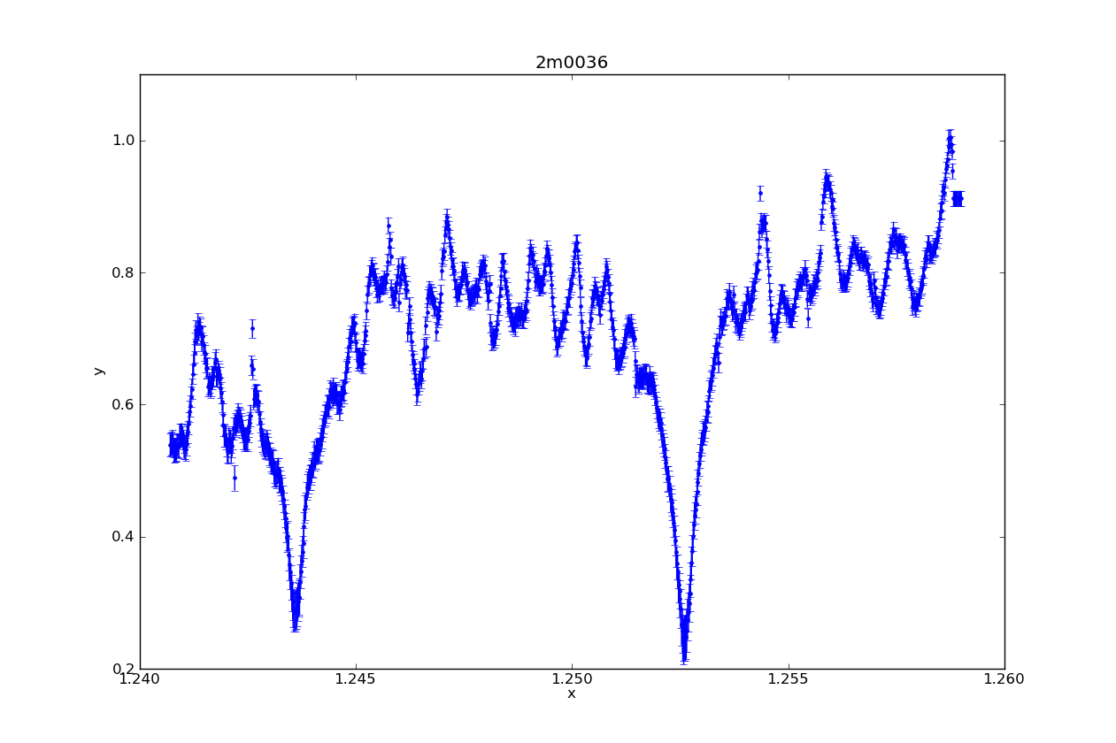
This week, I learned how to take a spectrum (wavelength, flux, and statistical error arrays) and load them into a Sherpa data structure, and then how to plot the spectrum using Sherpa (instead of, say, matplotlib). For the purpose of brevity, I will hand wave these commands and jump to the plots.

Above is a Sherpa plot of one of the L dwarfs in my sample. It is high resolution NIRSPEC data, order 61 (to highlight the Potassium lines). In one easy command (specifically, plot_data), it plotted not only the spectrum, but the statistical error (which I supplied it). It also automatically labeled the axes, and added a title with the name of the target.

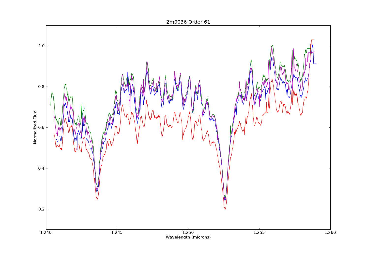
Above is a plot made in matplotlib. I made it not only to make a comparison of the plot styles of the two modules, but also to illustrate the difference between data taken on different nights. Each spectrum plotted here is order 61 from the same target as the Sherpa plot, but observed on different nights (the blue spectrum in this second plot exactly matches that of the first night). Also note that I did not plot the stat. error on the second figure. What stands out for me is that while you can easily notice the jumpiness of the pseudo-continuum, the pseudo-continuum itself is similar on each night. So I think this shows that making a model fit for measuring the potassium features will be roughly the same regardless of the night used.

-Dan