This week, I began to play around with Sherpa, a scientific analysis tool written in Python. Sherpa has two options—you can either run it on its own (aka standalone Sherpa), or you can import it as a Python module, and utilize it in your own scripts. I want to use it for my own purposes, so I’m using it as a module. I’ve been taking notes to use for later documentation on how to use the software to make the spectroscopic measurements mentioned in my previous post.
This week, I learned how to take a spectrum (wavelength, flux, and statistical error arrays) and load them into a Sherpa data structure, and then how to plot the spectrum using Sherpa (instead of, say, matplotlib). For the purpose of brevity, I will hand wave these commands and jump to the plots.
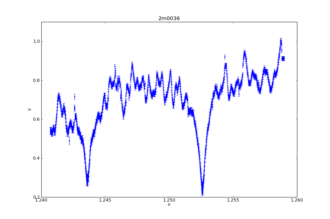
Above is a Sherpa plot of one of the L dwarfs in my sample. It is high resolution NIRSPEC data, order 61 (to highlight the Potassium lines). In one easy command (specifically, plot_data), it plotted not only the spectrum, but the statistical error (which I supplied it). It also automatically labeled the axes, and added a title with the name of the target.
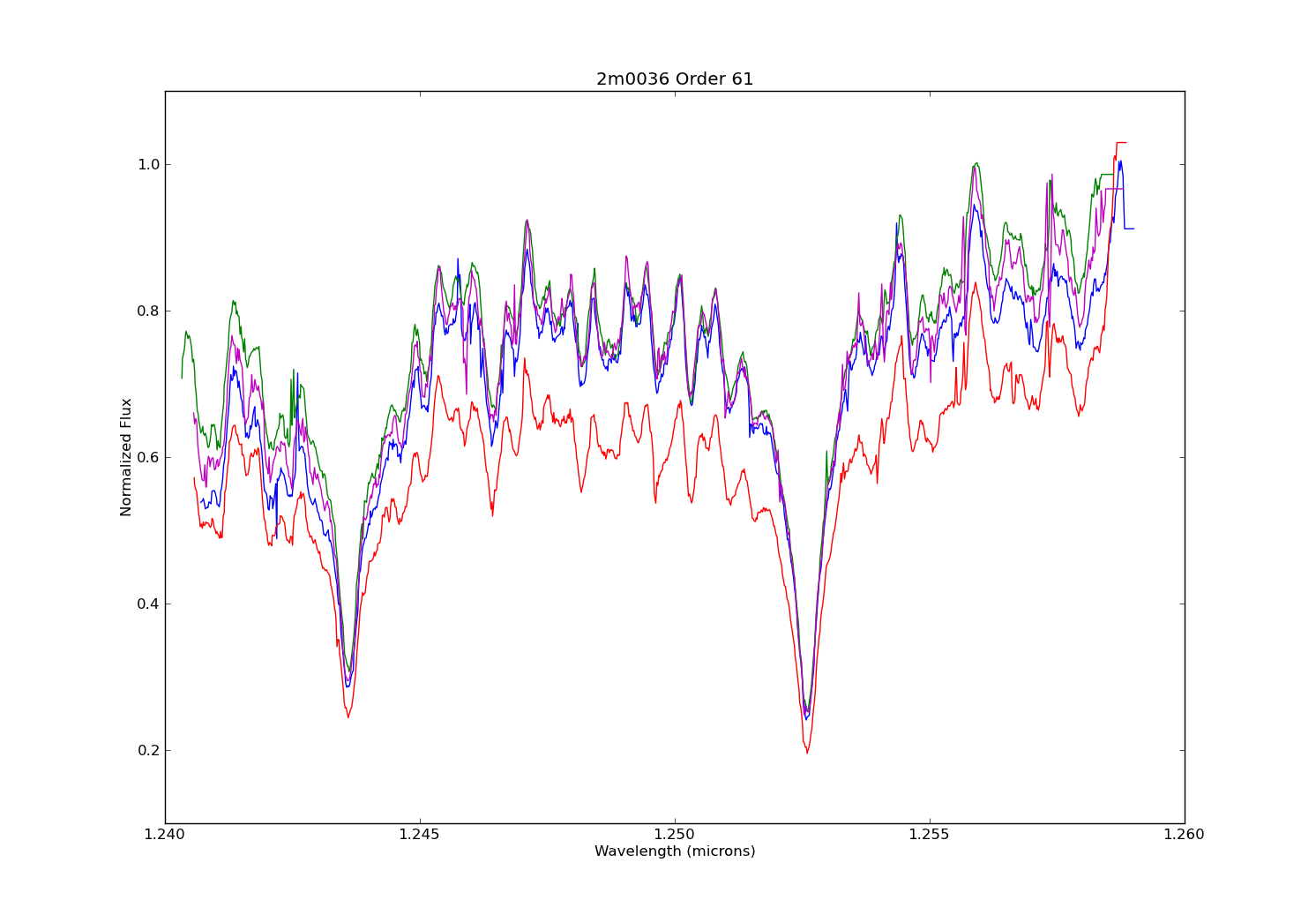
Above is a plot made in matplotlib. I made it not only to make a comparison of the plot styles of the two modules, but also to illustrate the difference between data taken on different nights. Each spectrum plotted here is order 61 from the same target as the Sherpa plot, but observed on different nights (the blue spectrum in this second plot exactly matches that of the first night). Also note that I did not plot the stat. error on the second figure. What stands out for me is that while you can easily notice the jumpiness of the pseudo-continuum, the pseudo-continuum itself is similar on each night. So I think this shows that making a model fit for measuring the potassium features will be roughly the same regardless of the night used.
-Dan


