Identifying Nearby Young Stars, Part 1: Young Star Isochrones

As stars form, their position on the HR diagram (or, equivalently, a Color-Magnitude diagram) changes.   They start out very cool but physically very large and very bright; as they collapse under gravity and become fully supported by hydrogen fusion power, they become smaller and dimmer.

The practical upshot of all of this is that we can determine the ages of stars based on their HR diagram locations – for a given luminosity and color, there is an associated age.  This is particularly useful for low-mass objects, which take extremely long times to reach the main sequence: An M0 star probably takes 200 Myr to reach the main sequence (Dotter et al. 2008), while a brown dwarf will never reach any kind of main sequence, and will slowly cool and dim forever.

Typically, people use theoretical stellar evolution models like Baraffe et al. (1998), but in practice it is also possible to make empirical relations from known young stars with parallaxes, by fitting polynomials to them.  The diagram below shows a set of fifth-order (x5) polynomials that were fit to the single-star members of nearby young associations, as they appeared in Riedel et al. (2011).

A color-magnitude diagram of nearby young low-mass stars

A Color-magnitude diagram (Absolute V magnitude versus V-K photometric color) of M dwarf stars with parallaxes. The main sequence is represented by stars with trigonometric (annual) parallaxes within 10 parsecs of the Sun. M dwarf members of associations that are less than ~100 Myr old and closer than 100 parsecs are represented as colored and shaped items on the plot, and empirical isochrones are also shown.

As expected, we see multi-magnitude differences in the luminosity of Epsilon Chameleon members (pink) versus similarly-colored members of TW Hydra (yellow) or Beta Pictoris (blue).  On this basis, I presumed the nearby M dwarf AP Columbae was probably older than Beta Pictoris, but younger than AB Doradus (which annoyingly lies within the range of high-metallicity main sequence stars).

Of course, these polynomials are not perfect – they are dependent on the quality of the parallaxes and whether a star actually is a single, “normal” member of the group… and the polynomials are only useful between the boundaries for which there is data to fit.  As of the time when I made these polynomial fits, there were only two young brown dwarfs — both members of TW Hydra — with parallaxes AND Johnson V photometry, which is why all the other lines terminate at the middle and hotter M spectral types.  If I replaced the Johnson V colors with something redder (I or J-band) it would be a lot easier to produce empirical isochrones for brown dwarfs… although at the moment, extremely few young brown dwarfs are known.

Spectral Energy Distributions

The goal here was to investigate the atmospheric properties of known young objects and identify new brown dwarf candidates by producing extended spectral energy distributions (SEDs).

These SEDs are constructed by combining WISE mid-infrared photometry with our extensive database of optical and near-infrared spectra and parallaxes. The BDNYC Database has about 875 objects and the number of objects with parallaxes is about 250.

My code queries the database and the parallax measurements by right ascension and declination and then identifies the matches with enough spectra and photometry to produce an SED. Next, it checks the flux and wavelength units and makes the appropriate conversions to [ergs][s-1][cm-2][cm-1] and [um] respectively.

It then runs a fitting routine across BT-Settl models of every permutation of:

  • 400 K < Teff < 4500 K in 50 K increments,
  • 3.0 dex < log(g) < 5.5 dex in 0.1 dex increments, and
  • 0.5 MJup < radius < 1.3 MJup in 0.05 MJup increments.

Once the best match is found, it plots the synthetic spectrum (grey) along with the photometric points converted to flux in each SDSS, 2MASS and WISE bands (grey dots). In this manner, the fitting routine guesses the effective temperature, surface gravity and radius simultaneously.

Here are some preliminary plots:

Converting Between Decimal Degrees and Hours, Minutes, Seconds

Here’s a quick Python snippet I wrote to convert right ascension in decimal degrees to hours, minutes, seconds and declination to (+/-)degrees, minutes, seconds.

def deg2HMS(ra='', dec='', round=False):
  RA, DEC, rs, ds = '', '', '', ''
  if dec:
    if str(dec)[0] == '-':
      ds, dec = '-', abs(dec)
    deg = int(dec)
    decM = abs(int((dec-deg)*60))
    if round:
      decS = int((abs((dec-deg)*60)-decM)*60)
    else:
      decS = (abs((dec-deg)*60)-decM)*60
    DEC = '{0}{1} {2} {3}'.format(ds, deg, decM, decS)
  
  if ra:
    if str(ra)[0] == '-':
      rs, ra = '-', abs(ra)
    raH = int(ra/15)
    raM = int(((ra/15)-raH)*60)
    if round:
      raS = int(((((ra/15)-raH)*60)-raM)*60)
    else:
      raS = ((((ra/15)-raH)*60)-raM)*60
    RA = '{0}{1} {2} {3}'.format(rs, raH, raM, raS)
  
  if ra and dec:
    return (RA, DEC)
  else:
    return RA or DEC

For example:
In [1]: f.deg2HMS(ra=66.918277)
Out[1]: '4 27 40.386'

Or even:
In [2]: f.deg2HMS(dec=24.622590)
Out[2]: '+24 37 21.324'

Or if you want to round the seconds, just do:
In [3]: f.deg2HMS(dec=24.622590,round=True)
Out[3]: '+24 37 21'

And to convert hours, minutes and seconds into decimal degrees, we have:

def HMS2deg(ra='', dec=''):
  RA, DEC, rs, ds = '', '', 1, 1
  if dec:
    D, M, S = [float(i) for i in dec.split()]
    if str(D)[0] == '-':
      ds, D = -1, abs(D)
    deg = D + (M/60) + (S/3600)
    DEC = '{0}'.format(deg*ds)
  
  if ra:
    H, M, S = [float(i) for i in ra.split()]
    if str(H)[0] == '-':
      rs, H = -1, abs(H)
    deg = (H*15) + (M/4) + (S/240)
    RA = '{0}'.format(deg*rs)
  
  if ra and dec:
    return (RA, DEC)
  else:
    return RA or DEC

So we can get back our decimal degrees with:

In [4]: f.HMS2deg(ra='4 27 40.386', dec='+24 37 21.324')
Out[4]: (66.918, 24.622)

How to Make Animated GIFs of Plots

So you’re swimming in countless plots of your data over some changing parameter. Sure they’re nice to look at, but are they animated? Didn’t think so.

Here’s how to create an animated .gif image of those Python plots using Photoshop.

Step 1: Generate the plots

I’ve found that a few lines of Python to programmatically draw and save your plots to a folder eliminates a lot of editing and tweaking later on.

For this tutorial, I’ll use my synthetic photometry code to generate color-parameter plots across surface gravities of 3.0dex to 6.0dex.

First I created a folder on my desktop to dump the plots called RI_teff.

Then in the Python interpreter it looks like:

In [1]: grav = [round(i*0.1,1) for i in range(30,61)]
In [2]: import syn_phot as s
In [3]: for i in g:
s.color_param('R','I',logg=i,save='/Desktop/RI_teff/')

Now I can create the animated .gif in Photoshop.

Step 2: Pull plots into Photoshop as layers

Open Photoshop and click File > Scripts > Load Files into Stack…

Select the folder on your Desktop that has all the plots and click ok.

Photoshop will open each image as a layer in a new project window.

Step 3: Create frames from each layer

Next click Window > Timeline to show the Timeline across the bottom of the program.

In the top-right corner of your Timeline, you’ll see a little button that has all the Timeline options. Click it and select Make Frames From Layers. Here’s what it looks like:

This will populate your Timeline with one frame for each image layer.

Click the Timeline options button again and click Reverse Frames if necessary. Otherwise, you can drag and drop the frames into the desired order.

Step 4: Timing is everything

Next we need to set the timing of each frame. Select the first frame from the Timeline then hold down the Shift button and select the last frame to select them all.

Next click on any frame where it says 0 sec. with a down arrow. Then select the display time for each frame in the animation.

I typically set the frames to be 0.2 or 0.5 seconds each, depending on the number of total frames. Then I set the last frame to be 2 seconds so it’s as if the image pauses when it finishes before starting the animation over.

Step 5: Save it!

Finally, click File > Save for Web… and make sure you have GIF filetype selected. Click Save and you’re done! Here’s the result:

Editing PYTHONPATH (or “Where’s my module?!”)

Python not finding your modules with import MyModule for some reason? It’s probably your PYTHONPATH. Here’s how you edit it so that Python sees all your modules.

A Word About Directories

Firstly, if you are the kind of person who keeps files scattered about your computer, dumps everything into the root directory, or is afraid to use those nice little blue folders, then perhaps programming and computers in general are not for you.

Logical and neat directory structure will make your own, your computer’s and your collaborators’ lives much easier.

My recommendation: Create a master code directory (called “Modules” or something) in your Documents folder. This will be the new home of all your future Python projects.

Now every time you create a .py file, it should go into a project folder inside your Modules directory, i.e. /Documents/Modules/NewProject/MyModule.py. Note that you should have no actual modules inside your Modules directory! Keep those puppies in their warm, snuggly project subdirectories.

This way you can also initialize that project folder (i.e. /NewProject) as a Git repository and just push and pull the contents to keep it up-to-date!

Editing PYTHONPATH

Python won’t just search your computer for the MyModule.py file you’re trying to import. You have to tell it explicitly each time where to get it. The PYTHONPATH is a list of directories for your computer to check whenever you type import MyModule into the interpreter.

To add a path, launch ipython and type:

import sys
sys.path.append("path/to/Modules")
print sys.path

Note: You only have to update your PYTHONPATH once, not every time you use Python!

So now your path is updated but this is only the path to your master Python folder.

In order to have Python see the modules inside each subdirectory, add a blank file called __init__.py to each subdirectory (with two underscores on each side).

Now to import the module and use a function called foo() do:

from NewProject import MyModule as m
m.foo()

That is, it’s checking the main python directory you added to your PYTHONPATH, then looking within the NewProject subdirectory via the __init__.py file for the module you’re trying to import.

Brown Dwarf Synthetic Photometry

The goal here was to get the synthetic colors in the SDSS, 2MASS and WISE filters of ~2000 model objects generated by the PHOENIX stellar and planetary atmosphere software.

Since it would be silly (and incredibly slow… and much more boring) to just calculate and store every single color for all 12 filter profiles, I wrote a module to calculate colors a la carte.

The Filters

I got the J, H, and K band relative spectral response (RSR) curves in the 2MASS documentation, the u, g, r, i and z bands from the SDSS documentation, and the W1, W2, W3, and W4 bands from the WISE documentation.

I dumped all my .txt filter files into one directory and wrote a function to grab them all, pull out the wavelength and transmission values, and output the filter name in position [0], x-values in [1], and y-values in [2]:

def get_filters(filter_directory):
  import glob, os
  files = glob.glob(filter_directory+'*.txt')
 
  if len(files) == 0:
    print 'No filters in', filter_directory
  else:
    filter_names = [os.path.splitext(os.path.basename(i))[0] for i in files]
    RSR = [open(i) for i in files]
    filt_data = [filter(None,[map(float,i.split()) for i in j if not i.startswith('#')]) for j in RSR]
    for i in RSR: i.close()
 
    RSR_x = [[x[0] for x in i] for i in filt_data]
    RSR_y = [[y[1] for y in i] for i in filt_data]
    filters = {}
    for i,j,k in zip(filter_names,RSR_x,RSR_y):
      filters[i] = j, k, center(i)
 
    return filters

Calculating Apparent Magnitudes

We can’t have colors without magnitudes so here’s a function to grab the Teff and log g specified spectra, and calculate the apparent magnitudes in a particular band:

def mags(band, teff='', logg='', bin=1):
  from scipy.io.idl import readsav
  from collections import Counter
  from scipy import trapz, log10, interp
  
  s = readsav(path+'modelspeclowresdustywise.save')
  Fr, Wr = [i for i in s.modelspec['fsyn']], [i for i in s['wsyn']]
  Tr, Gr = [int(i) for i in s.modelspec['teff']], [round(i,1) for i in s.modelspec['logg']]
  
  # The band to compute
  RSR_x, RSR_y, lambda_eff = get_filters(path)[band]
  
  # Option to specify an effective temperature value
  if teff:
    t = [i for i, x in enumerate(s.modelspec['teff']) if x == teff]
    if len(t) == 0:
      print "No such effective temperature! Please choose from 1400K to 4500K in 50K increments or leave blank to select all."
  else:
    t = range(len(s.modelspec['teff']))
  
  # Option to specify a surfave gravity value
  if logg:
    g = [i for i, x in enumerate(s.modelspec['logg']) if x == logg]
    if len(g) == 0:
      print "No such surface gravity! Please choose from 3.0 to 6.0 in 0.1 increments or leave blank to select all."
  else:
    g = range(len(s.modelspec['logg']))
  
  # Pulls out objects that fit criteria above
  obj = list((Counter(t) & Counter(g)).elements())
  F = [Fr[i][::bin] for i in obj]
  T = [Tr[i] for i in obj]
  G = [Gr[i] for i in obj]
  W = Wr[::bin]
  
  # Interpolate to find new filter y-values
  I = interp(W,RSR_x,RSR_y,left=0,right=0)
  
  # Convolve the interpolated flux with each filter (FxR = RxF)
  FxR = [convolution(i,I) for i in F]
  
  # Integral of RSR curve over all lambda
  R0 = trapz(I,x=W)
  
  # Integrate to find the spectral flux density per unit wavelength [ergs][s-1][cm-2] then divide by R0 to get [erg][s-1][cm-2][cm-1]
  F_lambda = [trapz(y,x=W)/R0 for y in FxR]
  
  # Calculate apparent magnitude of each spectrum in each filter band
  Mags = [round(-2.5*log10(m/F_lambda_0(band)),3) for m in F_lambda]
  
  result = sorted(zip(Mags, T, G, F, I, FxR), key=itemgetter(1,2))
  result.insert(0,W)
  
  return result

Calculating Colors

Now we can calculate the colors. Next, I wrote a function to accept any two bands with options to specify a surface gravity and/or effective temperature as well as a bin size to cut down on computation. Here’s the code:

def colors(first, second, teff='', logg='', bin=1):
  (Mags_a, T, G) = [[i[j] for i in get_mags(first, teff=teff, logg=logg, bin=bin)[1:]] for j in range(3)]
  Mags_b = [i[0] for i in get_mags(second, teff=teff, logg=logg, bin=bin)[1:]]
  colors = [round(a-b,3) for a,b in zip(Mags_a,Mags_b)]
  
  print_mags(first, colors, T, G, second=second)
  
  return [colors, T, G]

The PHOENIX code gives the flux as Fλ in cgs units [erg][s-1][cm-2][cm-1] but as long as both spectra are in the same units the colors will be the same.

Makin’ It Handsome

Then I wrote a short function to print out the magnitudes or colors in the Terminal:

def print_mags(first, Mags, T, G, second=''):
  LAYOUT = "{!s:10} {!s:10} {!s:25}"
  
  if second:
    print LAYOUT.format("Teff", "log g", first+'-'+second)
  else:
    print LAYOUT.format("Teff", "log g", first)
  
  for i,j,k in sorted(zip(T, G, Mags)):
    print LAYOUT.format(i, j, k)

The Output

Then if I just want the J-K color for objects with log g = 4.0 over the entire range of effective temperatures, I launch ipython and just do:

In [1]: import syn_phot as s
In [2]: s.colors('J','K', logg=4)
Teff -------- log g -------- J-K
1400.0 ------ 4.0 ---------- 4.386
1450.0 ------ 4.0 ---------- 4.154
...
4450.0 ------ 4.0 ---------- 0.756
4500.0 ------ 4.0 ---------- 0.733

Similarly, I can specify just the target effective temperature and get the whole range of surface gravities. Or I can specify an effective temperature AND a specific gravity to get the color of just that one object with:

In [3]: s.colors('i','W2', teff=3050, logg=5)
Teff -------- log g -------- J-K
3050.0 ------ 5.0 ---------- 3.442

I can also reduce the number of data points in each flux array if my sample is very large. I just have to specify the number of data points to skip with the “bin” optional parameter. For example:

In [4]: s.colors('W1','W2', teff=1850, bin=3)

This will calculate the W1-W2 color for all the objects with Teff = 1850K and all gravities, but only take every third flux value.

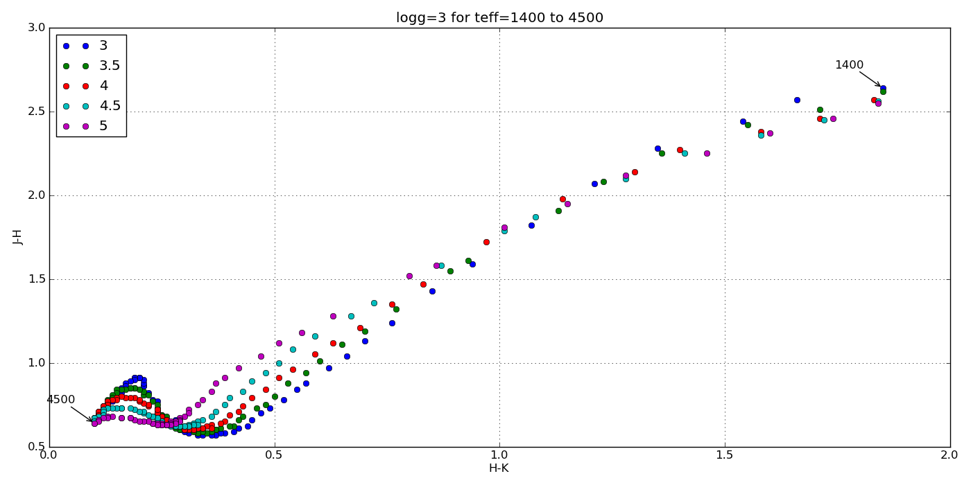
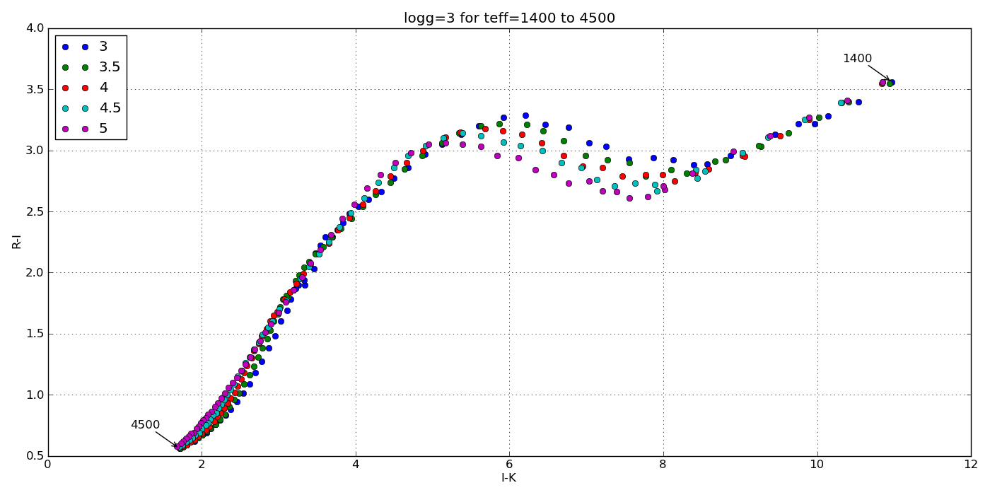
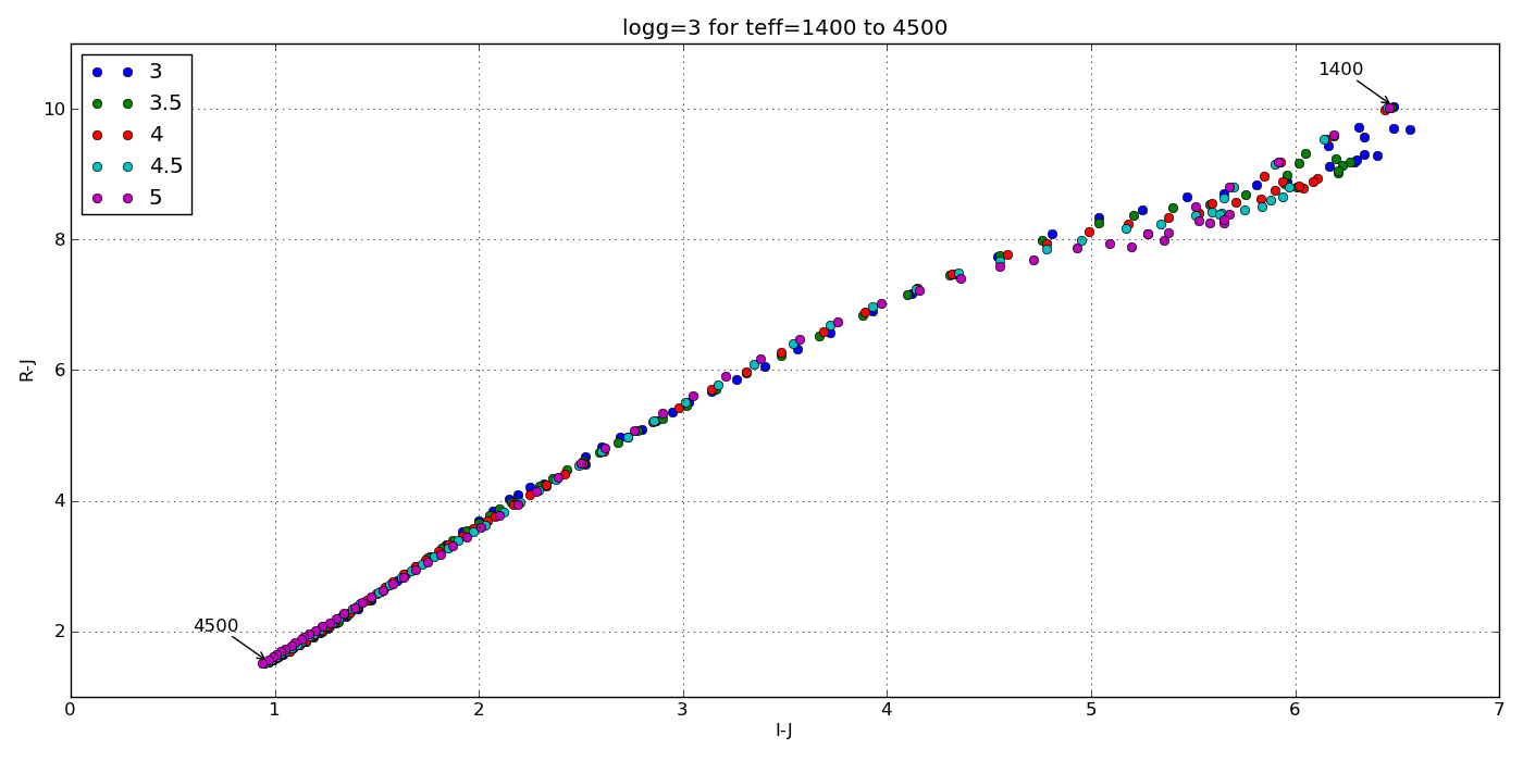
I also wrote functions to generate color-color, color-parameter and color-magnitude plots but those will be in a different post.

Plots!

Here are a few color-parameter animated plots I made using my code. Here’s how I made them. Click to animate!

And here are a few colorful-colorful color-color plots I made:

Plots with observational data

Just to be sure I’m on base, here’s a color-color plot of J-H vs. H-Ks for objects with a log surface gravity of 5 dex (blue dots) plotted over some data for the Chamaeleon I Molecular Cloud (semi-transparent) from Carpenter et al. (2002).

The color scale is for main sequence stars and the black dots are probable members of the group. Cooler dwarfs move up and to the right.

And here’s a plot of J-Ks vs. z-Ks as well as J-Ks vs. z-J. Again, the blue dots are from my synthetic photometry code at log(g)=5 and the semi-transparent points with errors are from Dahn et al. (2002).

How to embed a live Google Docs spreadsheet into a webpage

Let’s say you have a set of data in an Excel document or Google spreadsheet* and you want to share it with the public by posting it on your webpage. You no longer have to create a static HTML table; in fact, Google allows for embedding a table on a webpage that is updated as the original Google Doc is updated. The way to do it is by creating what is called a “live” spreadsheet.

The process is very simple and the results will definitely save you a lot of time.

  • First, import your Excel file in Google Docs or open your Google spreadsheet;
  • File > Publish to the Web…;
  • Check the box that says “Automatically republish when changes are made”;
  • Click “Start Publishing”;
  • Change “Get a link to the published data” from “Web page” to “HTML to embed in a page”;
  • Copy and paste the HTML code generated (should start in “<iframe”) in an HTML-enabled space on your webpage.

At this point, you would just need to make changes on your Google spreadsheet to see the table on your website edited as well. In my testing, the automatic update always worked flawlessly; however, if that does not happen:

  • Open your Google Doc;
  • File > Publish to the Web… > Republish now.
  • Magic! You should see the table data updated on your website.

This is how the embedded spreadsheet will appear on your webpage.

You can now adjust width, height and frameborder by changing the values in the <iframe> code in HTML mode.

Linking to the original Google Doc

Now, what if you also want users to be able to access your original table?

The way to do this is also very easy and I found it here (theBioBucket).

In your webpage, in HTML mode, write a code using the standard HTML notation to create a link <a href=”URL”> YOUR TEXT HERE </a>
The URL you will have to plug in is your Google doc one, found under “Share…”:

Click “Share…” under “File”

Grab the URL circled and paste it in the HTML code.

Once you’ve done that, you can simply write something like “Click here to access the Google document for this table” in the YOUR TEXT HERE space, and… all done!

A Google account is not necessary to view the original Google Doc. Any user on the web can access the original Google spreadsheet in view-only mode. They won’t be allowed to alter the original table in any way, but they will have access to a spreadsheet downloadable in different formats  (e.g. .pdf, .csv, .txt). To download, simply click File > Download as… and save the document on your computer in all the formats available in Google Docs.

* Note: This method works with every format available in Google Docs but this post focuses on spreadsheets.

find_unum: How to Quickly Find a U-number in the Database

The unique identifier of a target in the BDNYC database is its U-number. U-numbers are (almost) completely randomly assigned, and so there is no way of knowing a target’s U-number a priori. Kelle’s Access database is the only place where you can get a target’s U-number… until now.

The method find_unum in the BDNYC database is a quick way to find the U-number of a target. The method, of course, can be used only for targets that already exist in the database.

How you can use find_unum

You can find a U-number by right ascension (ra), declination, and/or any known name. The method gives you the flexibility to enter only one of these if you prefer, and it will print in your terminal the attributes of all targets matching your input.

Let’s look at an example. You need to find the U-number of a target with ra = 10 11 00.2. This is how you do it:

> bdnyc.find_unum(ra=’10 11 00.2′)

The output will be:

—–Potential match 1: —–
[‘unum’, ‘U10885’]
[‘index’, 286]
[‘name’, ‘TVLM 263-71765’]
[‘sptype’, ‘M7.5’]
[‘ra’, ’10 11 00.2′]
[‘dec’, ‘+42 45 03’]
[‘standard’, ‘No’]

Alternatively, instead of ’10 11 00.2′, you could enter ’10 11′, and the method will you give back all targets that have ra starting with ’10 11′.

If you prefer to get the method’s output not as a terminal print-out but as an object, then set the parameter dump as True. The output will be a Python list.

This is the complete method:

bdnyc.find_unum(ra=None, dec=None, name=None, dump=False)


xtellcor : construct kernel — dealing with missing orders or doublets.

In the help files, you are told that Pa δ contains the least contamination and therefore should be used for constructing the kernel. In cases where this feature shows a doublet, or if you weren’t able to save order 6 (the order that has that particular feature), then you need to use a different feature on another order.

ORDER 5: Generally least contaminated feature is Pa β as shown (Vacca et. al. 2003):

A fit with a polynomial of degree 3 should work just fine (tested on several objects, and data was arguably identical as when done with Pa δ in order 6), and should look a bit like this:

ORDER 4: After a bit of testing, it seems that the best feature here is Br 11, as shown (Vacca et. al. 2003):

A fit with polynomials of degree 2 or 3 should work just fine. If Br 11 has a doublet, please skip it. Doublets are never good.

ORDER 3: this order seems to be particularly tricky. At this wavelength, the data starts becoming a bit noisier. The best feature here is Br γ, found at roughly 2.17µ but can often look very contaminated. The majority of the data that I’ve had to deal with have had contamination and therefore it would be wise to not deal with this order unless there are no other options. If order 3 is the only option, then choose Br γ in the location shown below (Vacca et. al. 2003):

This blog post should take care of dealing with construction of spectra. One more point: when normalizing the spectrum, a max deviation around 5% and RMS deviation around 2% is generally acceptable. If max deviation is in the 2% range, and RMS is in the 1% range, then you should expect to produce excellent data.

xtellcor : shifting

>Palomar 200-in, Triple Spectrograph
>Slit: 1×30 arc seconds
>Wavelength coverage: 1.0 – 2.4µ
>Spectral resolution: 2500 – 2700
>Sampling: ~2.7 pixels per resolution element
—————————————————————————————

This is the first blog post of a series of posts detailing some tips and tricks in data reduction of medium resolution brown dwarf spectra (~2500-2700 spectral resolution, ~1.0-2.4µ, 1×30 arcsecond slit) taken from the triple spectrograph at the Palomar 200-in Telescope. The point of this series is to document some easy tips and solutions to small problems for people who are new to the data reduction process using the xSpexTool (Cushing et.al. 2004) and the xTellCor (Vacca et. al. 2003) packages. I’m currently in the process of writing a paper which will serve as a general introduction (targeted for complete beginners) to data reduction. That is soon to come. So let’s start this very brief post about the shifting step of the xtellcor package.

So, you’re at the last step in the xtellcor package:

This step is relatively important for medium resolution data. The whole point is for us to output spectra with enough details to distinguish well K, Na, etc. features, but bad shifting can really put a dent on clarity. Let’s use an example. Here we chose object 2m1658+70, with standard SAO 29723. Here is bad shifting (keep in mind, we are not trying hard to get bad data. We just chose a possible area which beginners might also choose):

The shift is 1.02. That should automatically start ringing some bells, because although a larger than normal shifting doesn’t necessarily mean it’s bad, it probably means it’s not optimal. Zoom in, and let us compare this shifting with a better one:

The shifting here is -0.41, less than half of the bad one. If you compare the bottom portion of both, you can see that the second one is much less “noisier” on the sides, and generally has clearer, more defined lines. After doing dozens and dozens of objects, it seems that the most optimal areas to select (using “s”) are:

>Order 3 — xMin: 1.965, xMax: 2.075 (roughly -0.40+0.1 shift)
>Order 4 — xMin: 1.455, xMax: 1.535 (roughly -0.30+0.1 shift)
>Order 5 — xMin: 1.180, xMax: 1.245 (roughly -0.45+0.1 shift)
>Order 6 — xMin: 1.100, xMax: 1.165 (roughly -0.20+0.1 shift)

That’s it! Enjoy the data reduction.